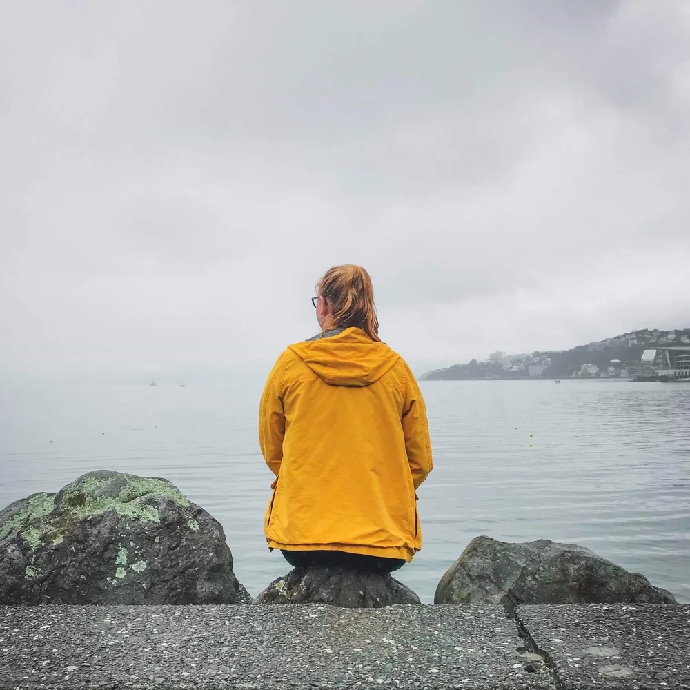
Design that makes people pause.
Clear, considered design helping brands communicate across publications, campaigns, and digital platforms.
Work
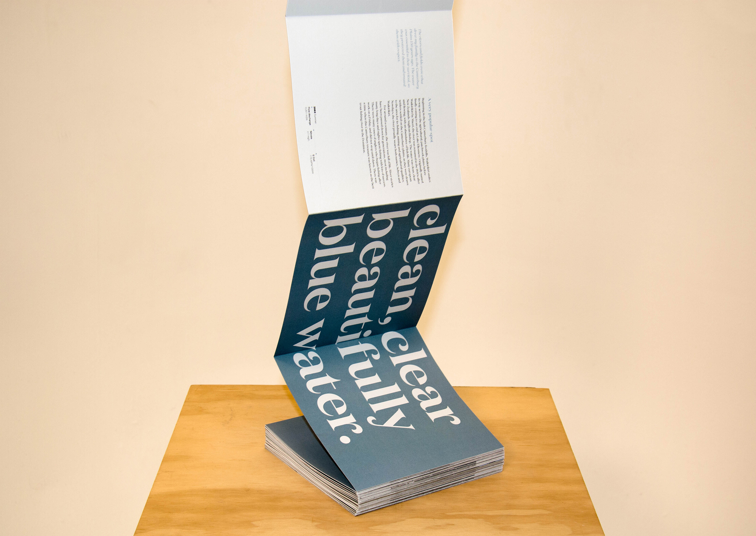
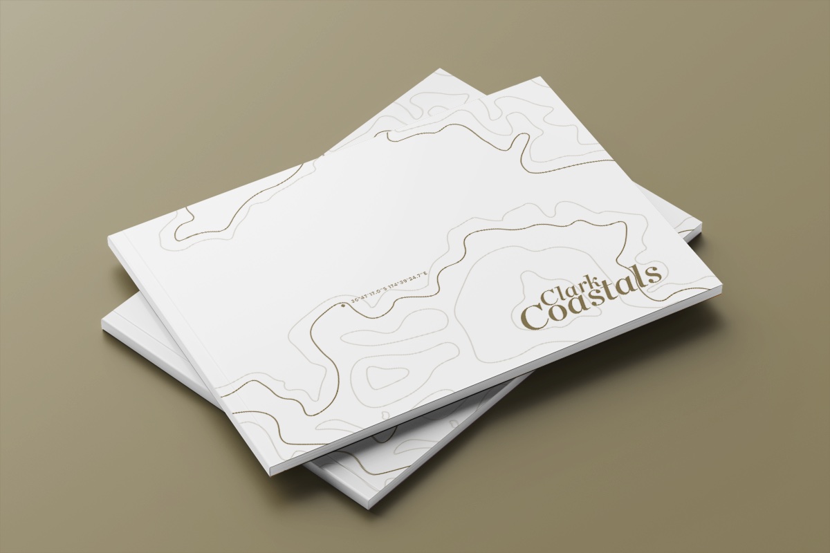
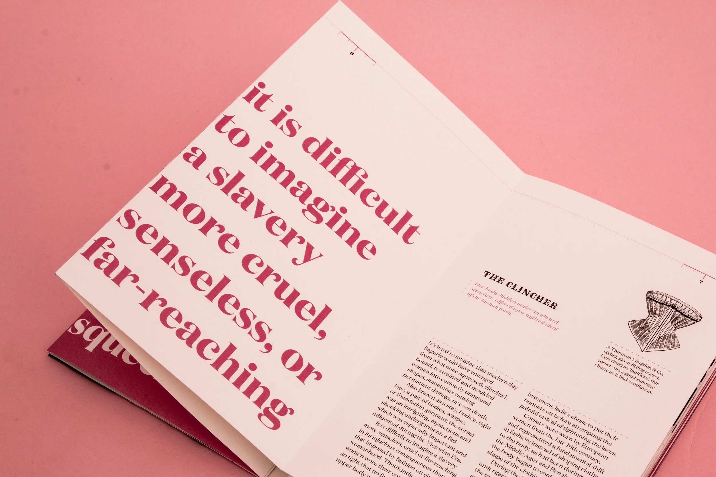

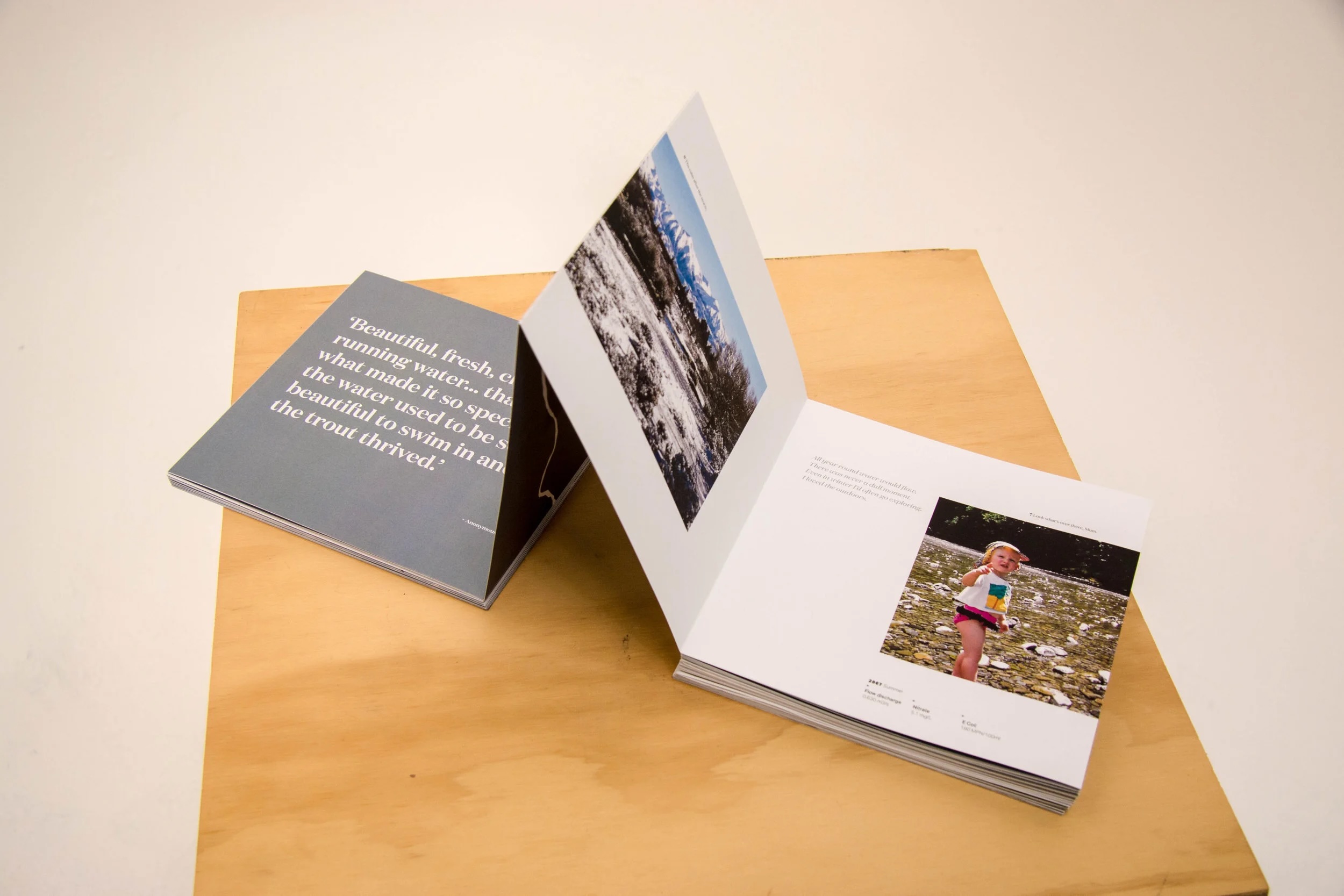
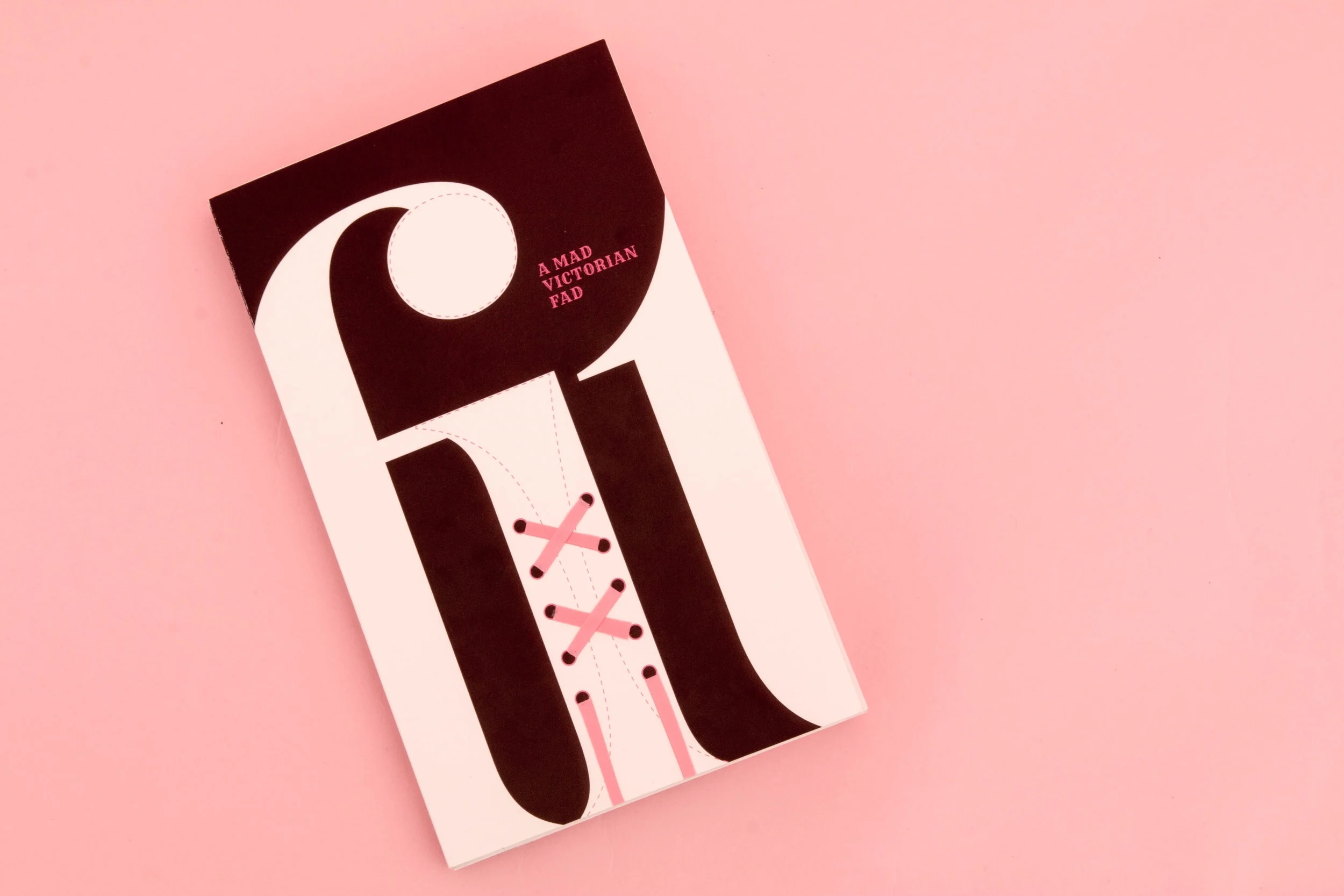
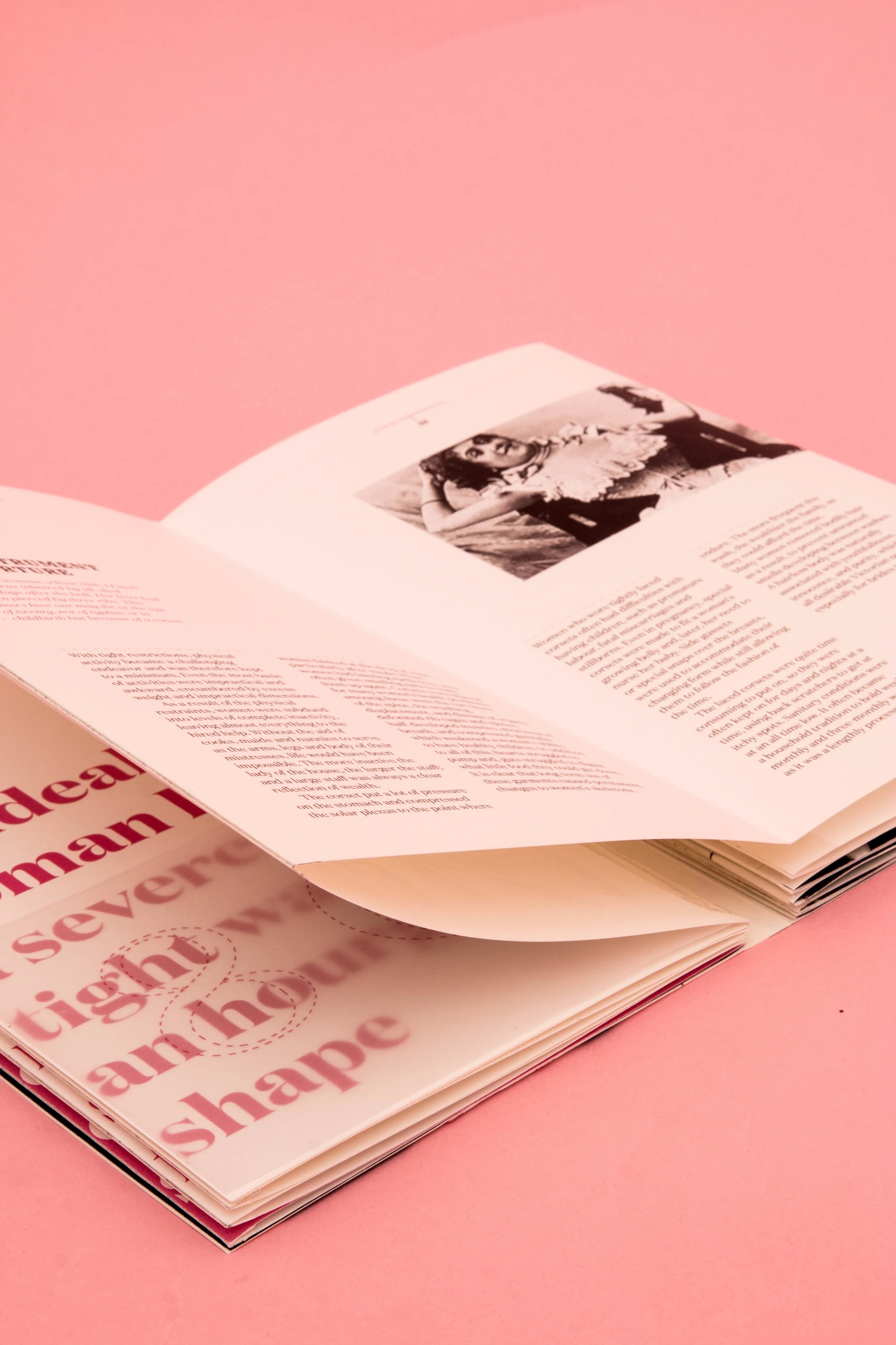
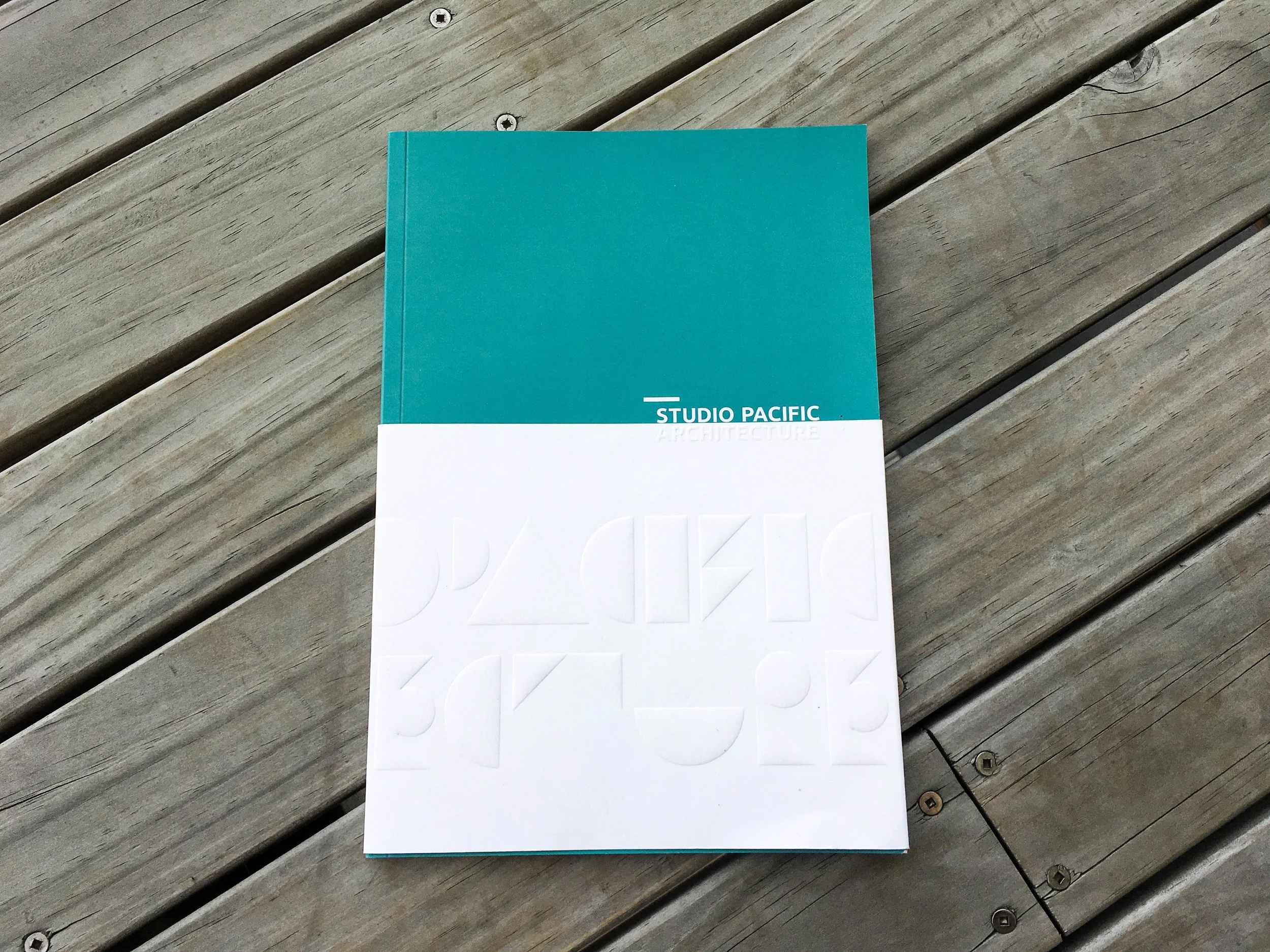
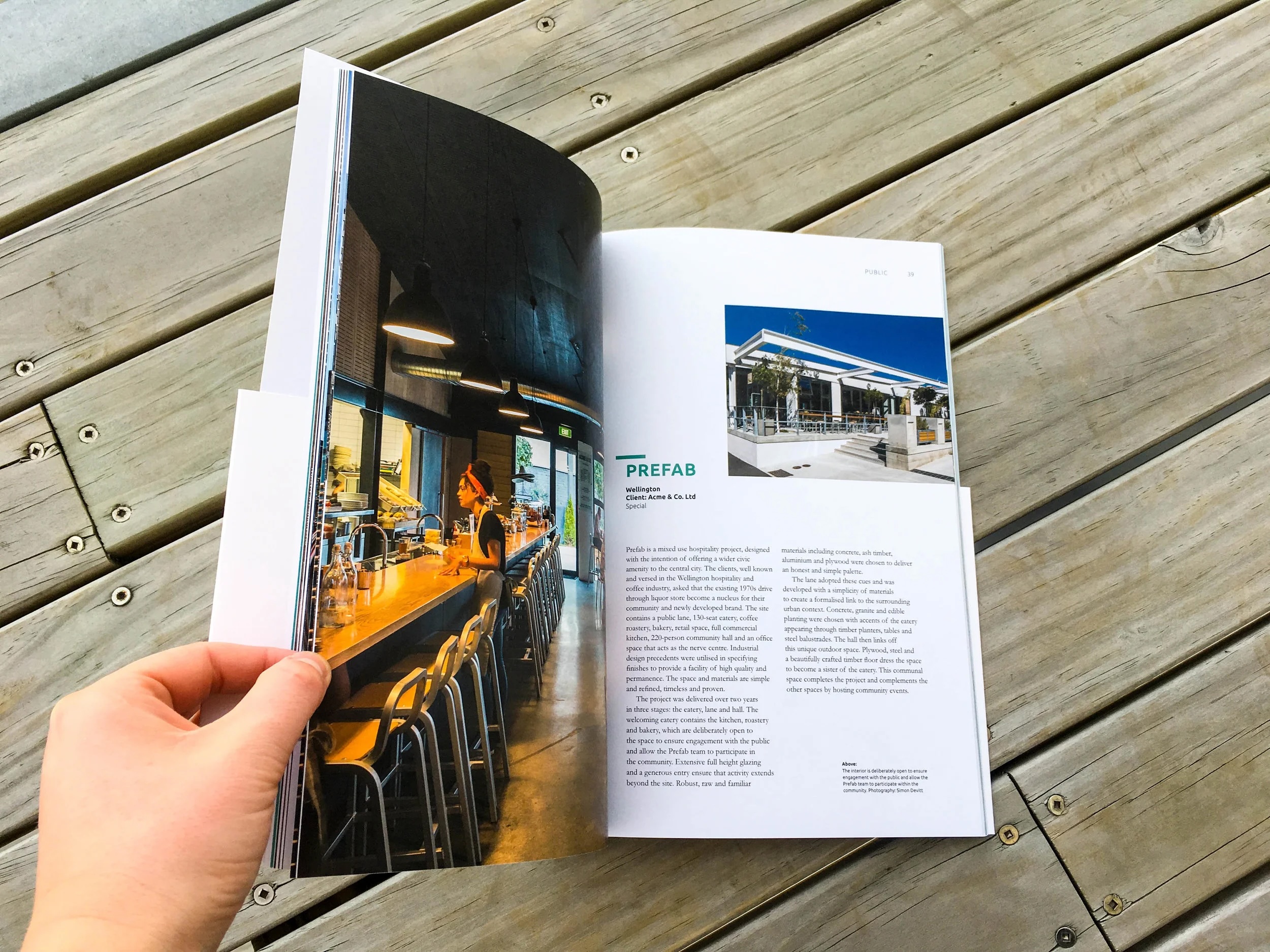
Publication & Editorial Design
Structured, typographic layouts designed for clarity, engagement, and a refined reading experience across editorial and print formats.
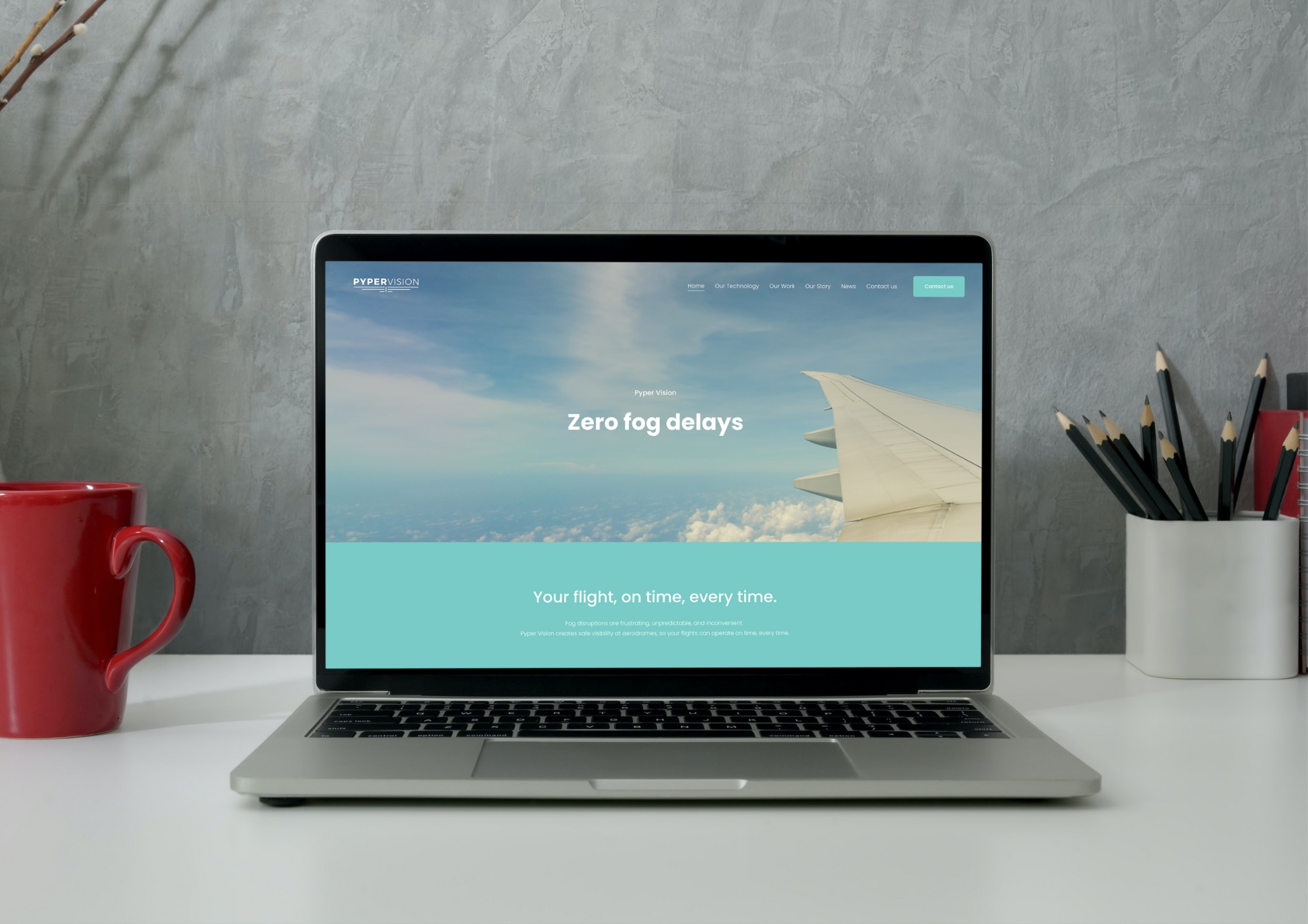
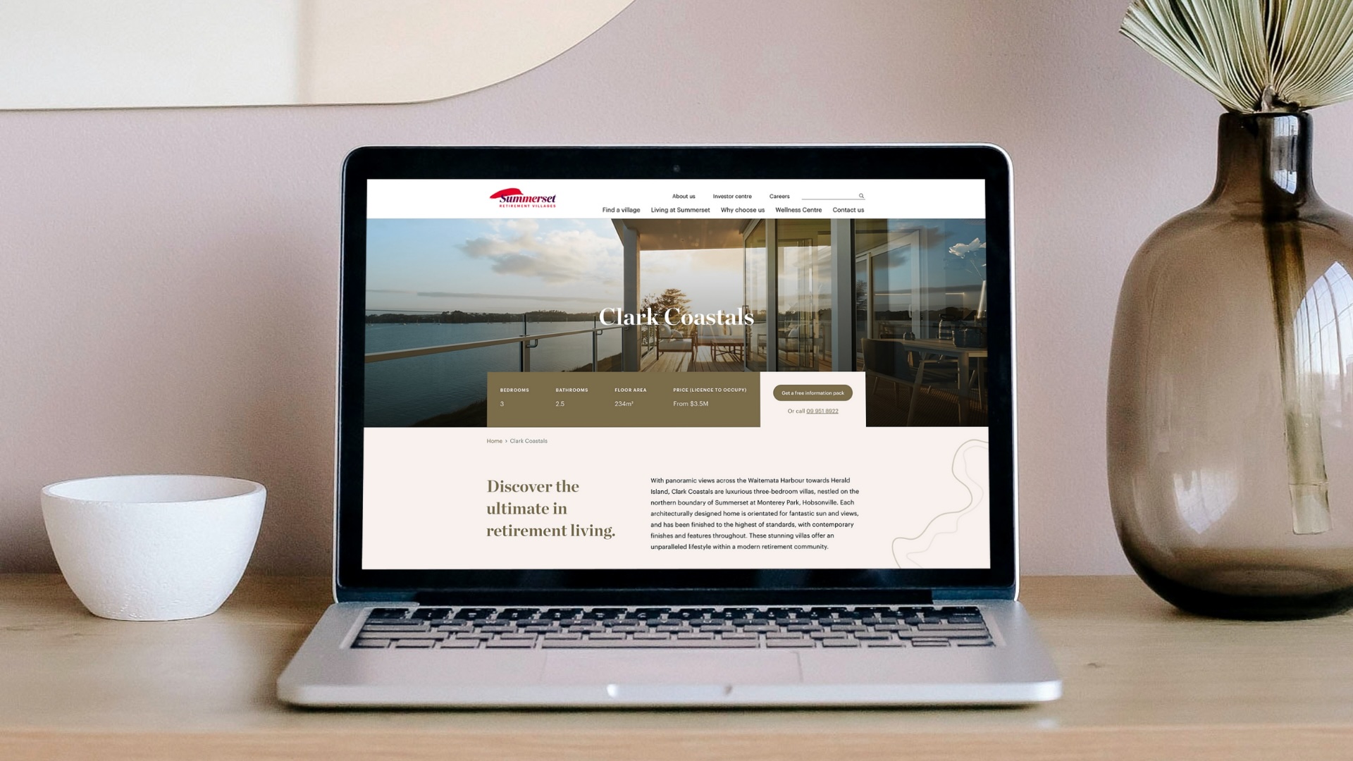
Digital & Web Design Systems
Designing clear, consistent digital experiences that extend brand identity across websites, socials and other online platforms.
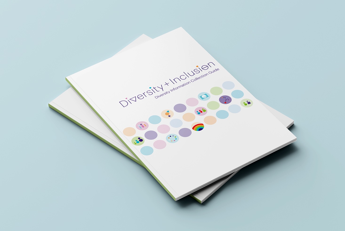
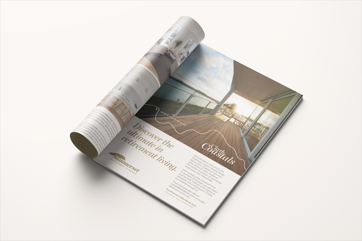
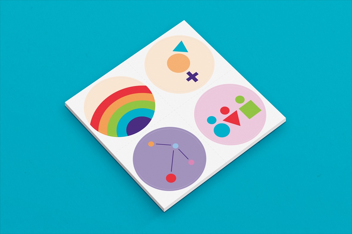
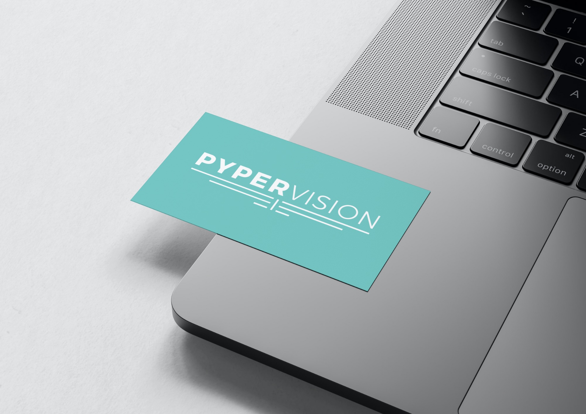
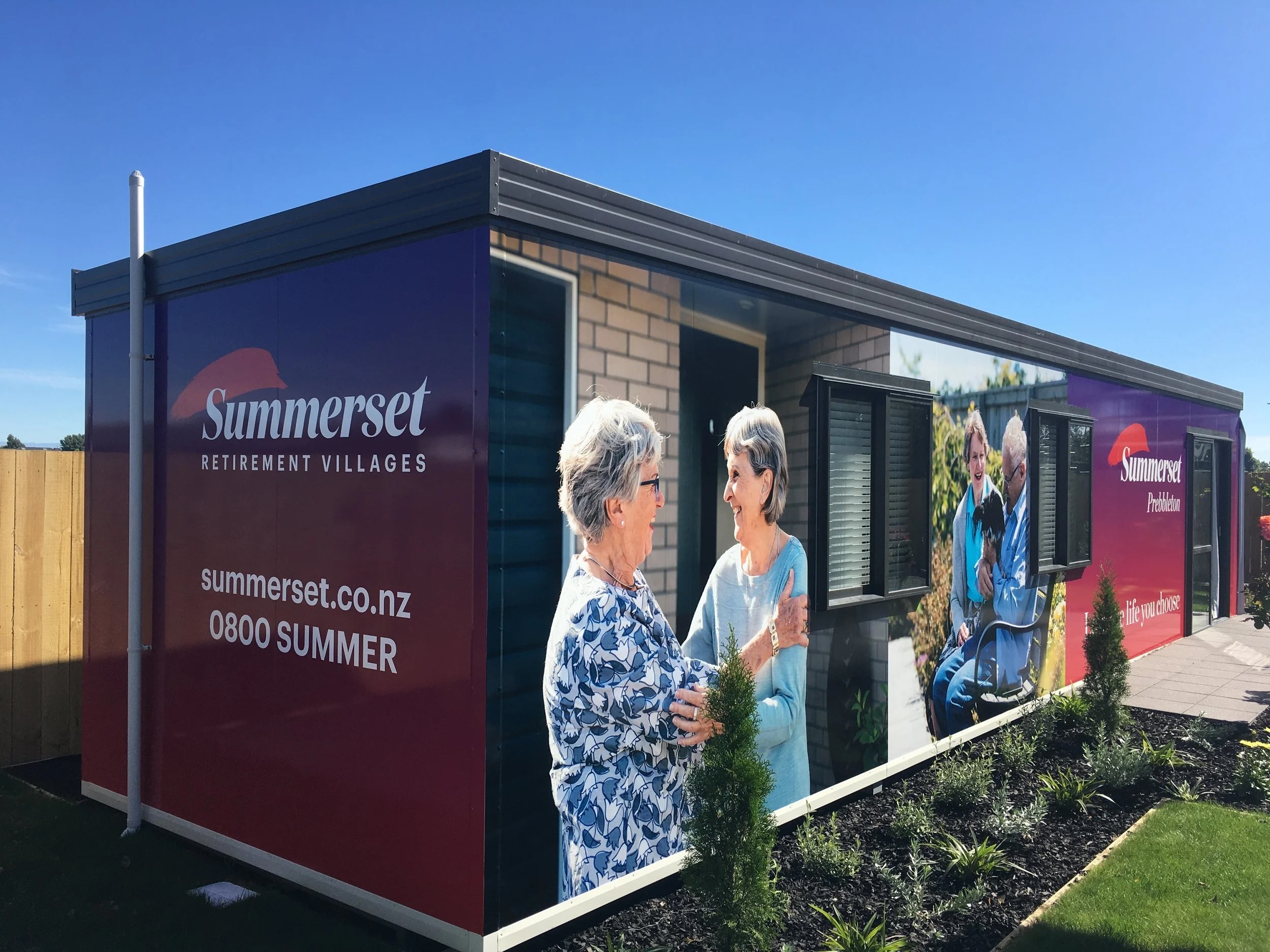
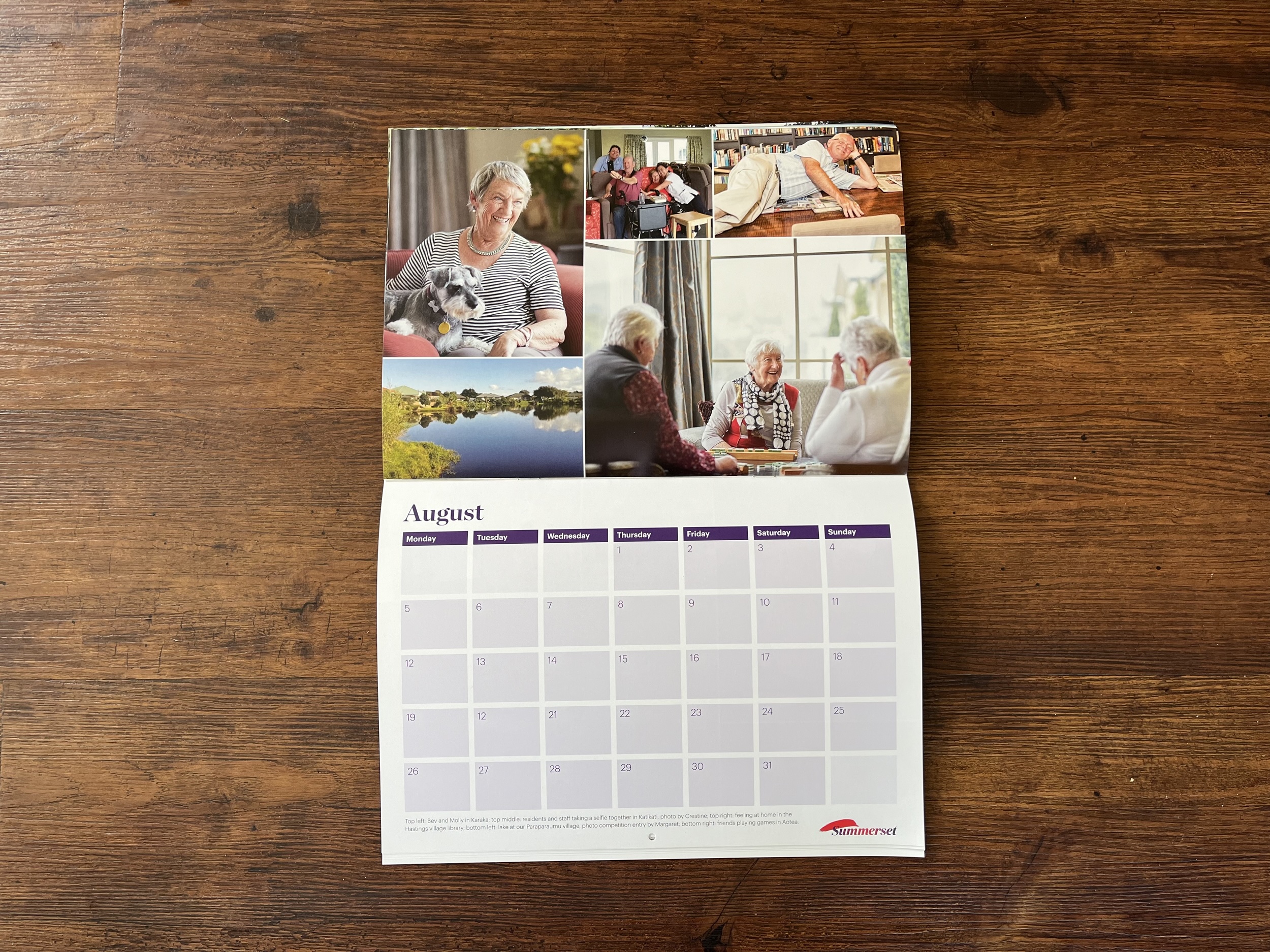
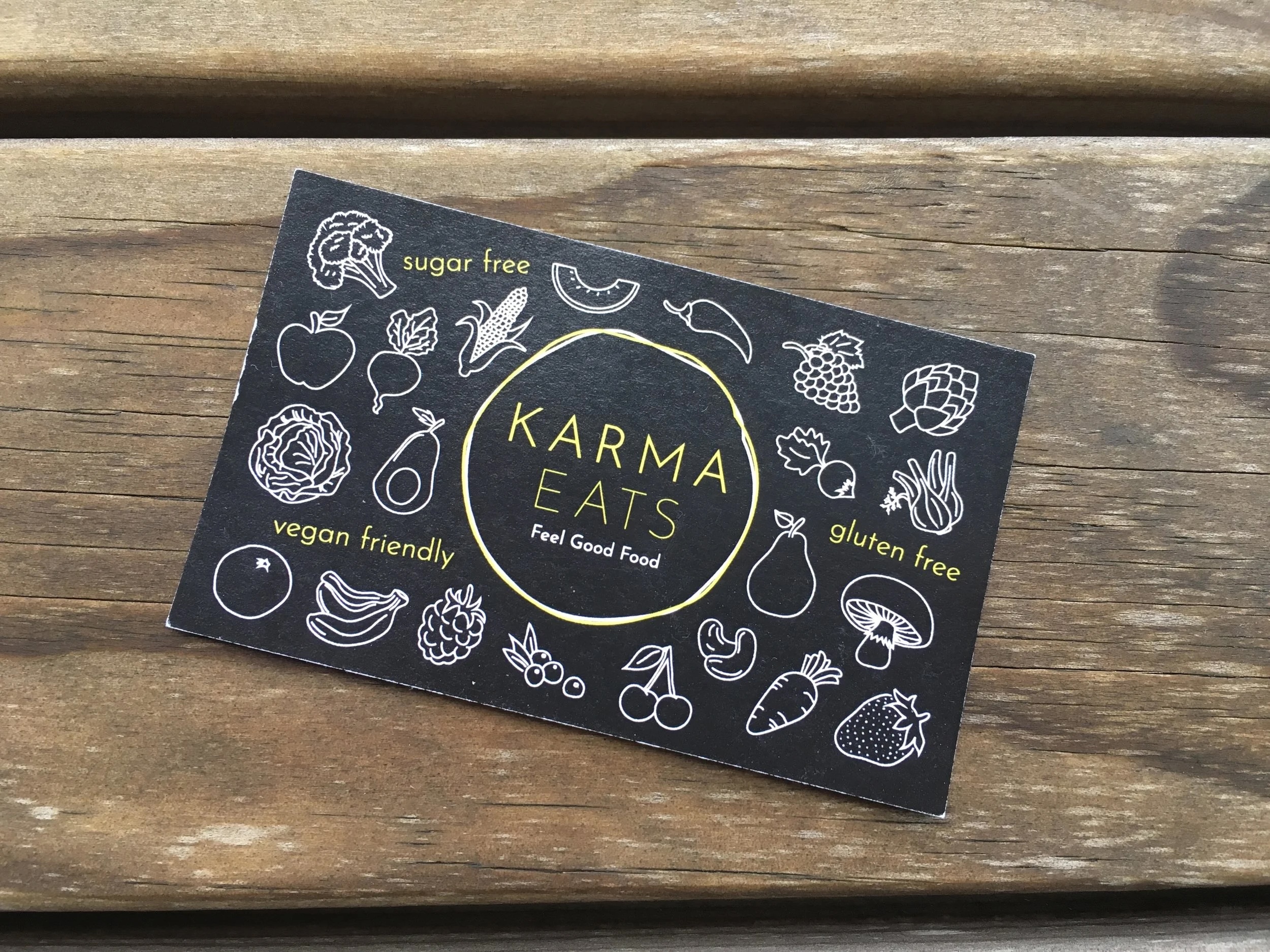
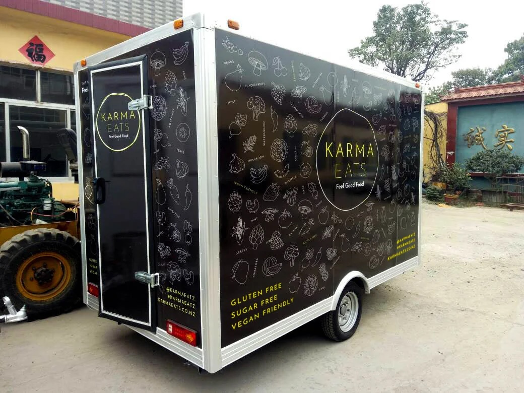
Brand Collateral & Campaign Design
Working within established brand systems to create cohesive, high-quality assets that support campaigns, marketing, and day-to-day brand communication.
If you’re looking for considered, detail-driven design, I’m currently available for freelance and contract projects. Feel free to get in touch at hello.genevieves.design@gmail.com — I’d love to hear what you’re working on.
Get in Touch
I’m Genevieve, a Canterbury-based designer with a love for all things typographic. I create work that feels deliberate and visually refined, for those who value clarity, consistency, and the finer details.
I care about how small design decisions shape the overall experience. Whether working within an established identity or developing something new, I apply design thoughtfully across print, digital, and campaigns. If you need thoughtful, detail-driven design, I’d love to hear about it.
Feel free to get in touch at hello.genevieves.design@gmail.com. I’ll reply as soon as I can and am looking forward to connecting with you.