

Overview
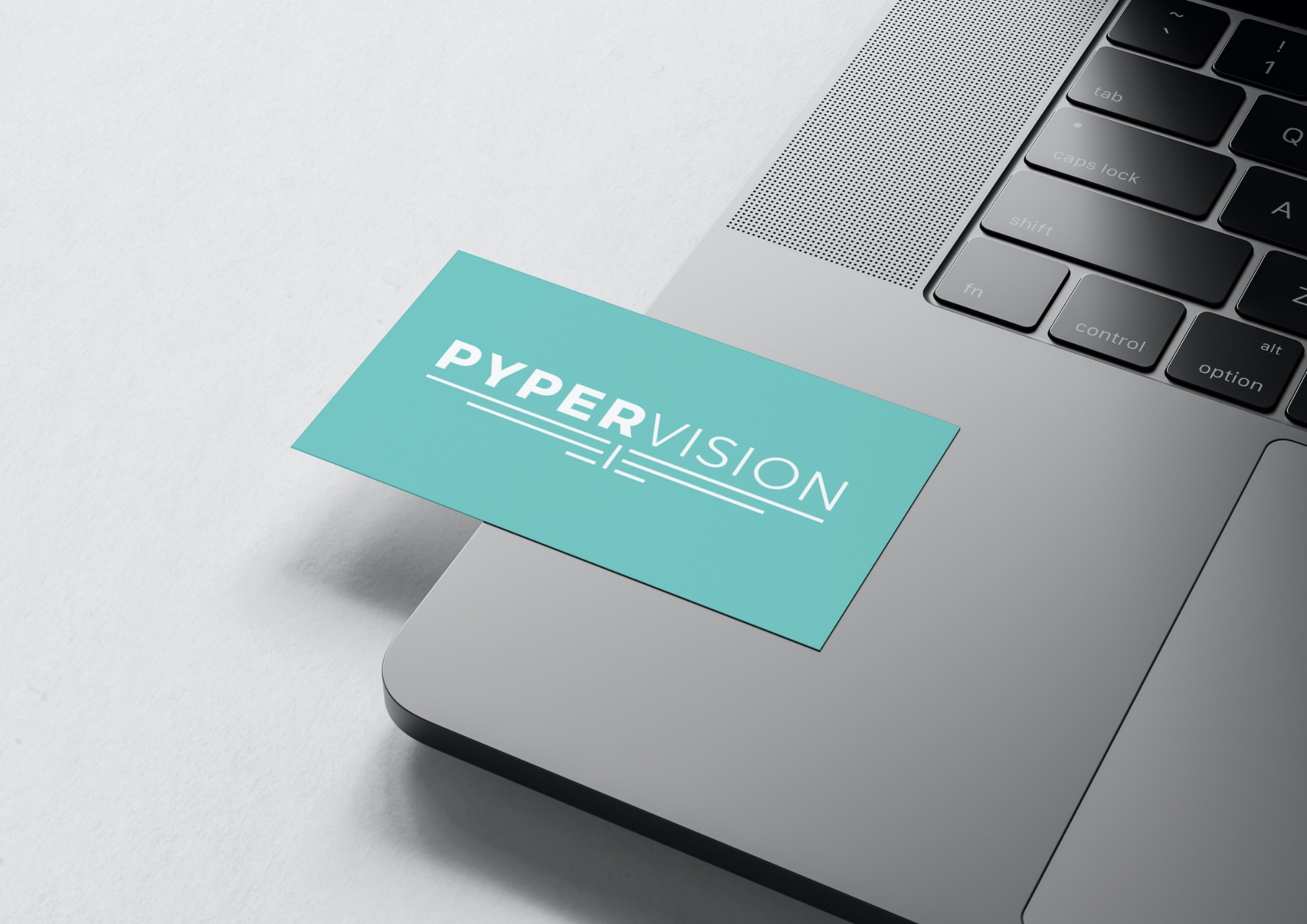
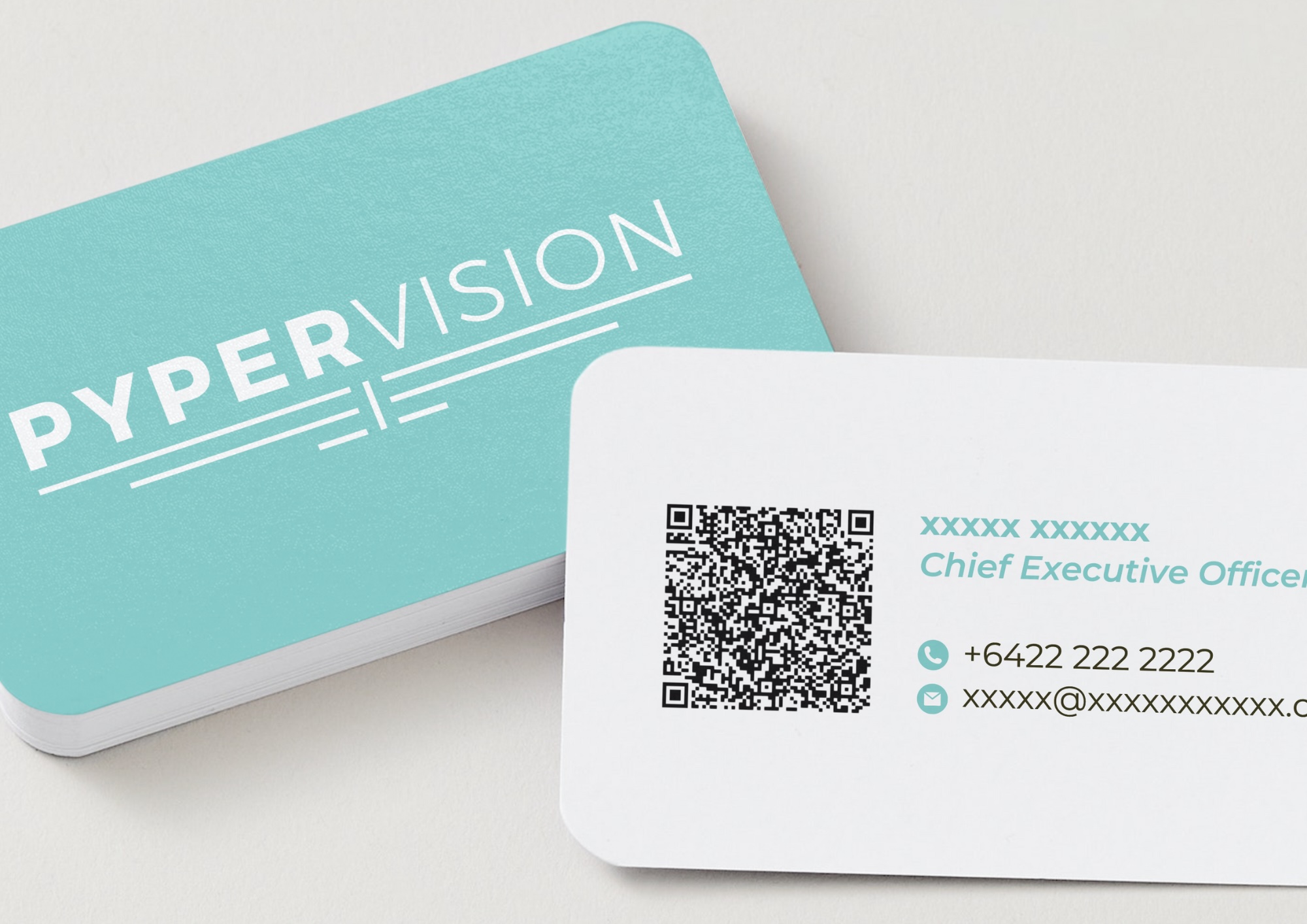
Pyper Vision required a brand refresh to better reflect the clarity and reliability of their service. The project involved refining the existing logo and developing a cohesive visual identity that could extend across digital and marketing touchpoints.
Context
Operating within a highly specific technical space, the brand needed to communicate trust, precision, and innovation. The challenge was to elevate the existing identity while maintaining recognisability, ensuring the refresh felt both considered and commercially appropriate.
Approach
The refresh centred on a refined blue palette, referencing the atmospheric conditions the technology operates within. A more defined blue was introduced to improve visibility and on-screen clarity, while maintaining technical precision. The logo was subtly refined to improve balance and legibility, supporting a cohesive and adaptable identity.
Outcome
The updated identity delivers a clearer, more confident brand presence. The system was applied across marketing collateral and presentation design, creating consistency across touchpoints and strengthening the overall perception of the business.
Interested in working together? Contact me at hello.genevieves.design@gmail.com