
Overview
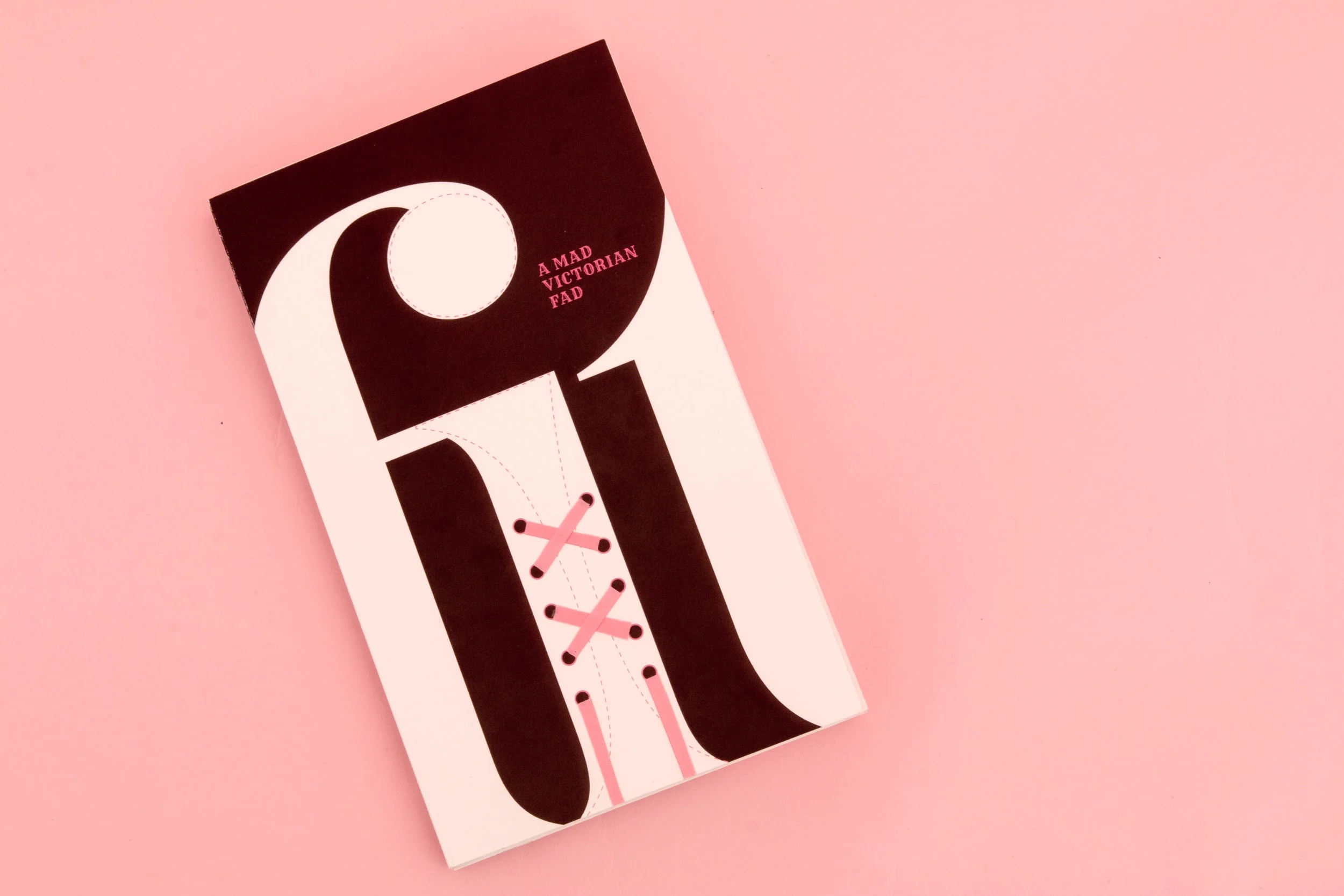
FAD is a typographic publication exploring fashion, restriction, and absurdity through historical ideals of the female form. It reflects on how trends emerge, intensify, and fade within culture over time.
Context
The project draws on the extreme shaping and restriction of the female form, where clothing was historically used to manipulate posture, silhouette, and behaviour. This context is contrasted with modern ideas of fashion and desire, highlighting the recurring nature of aesthetic obsession across time.
Approach
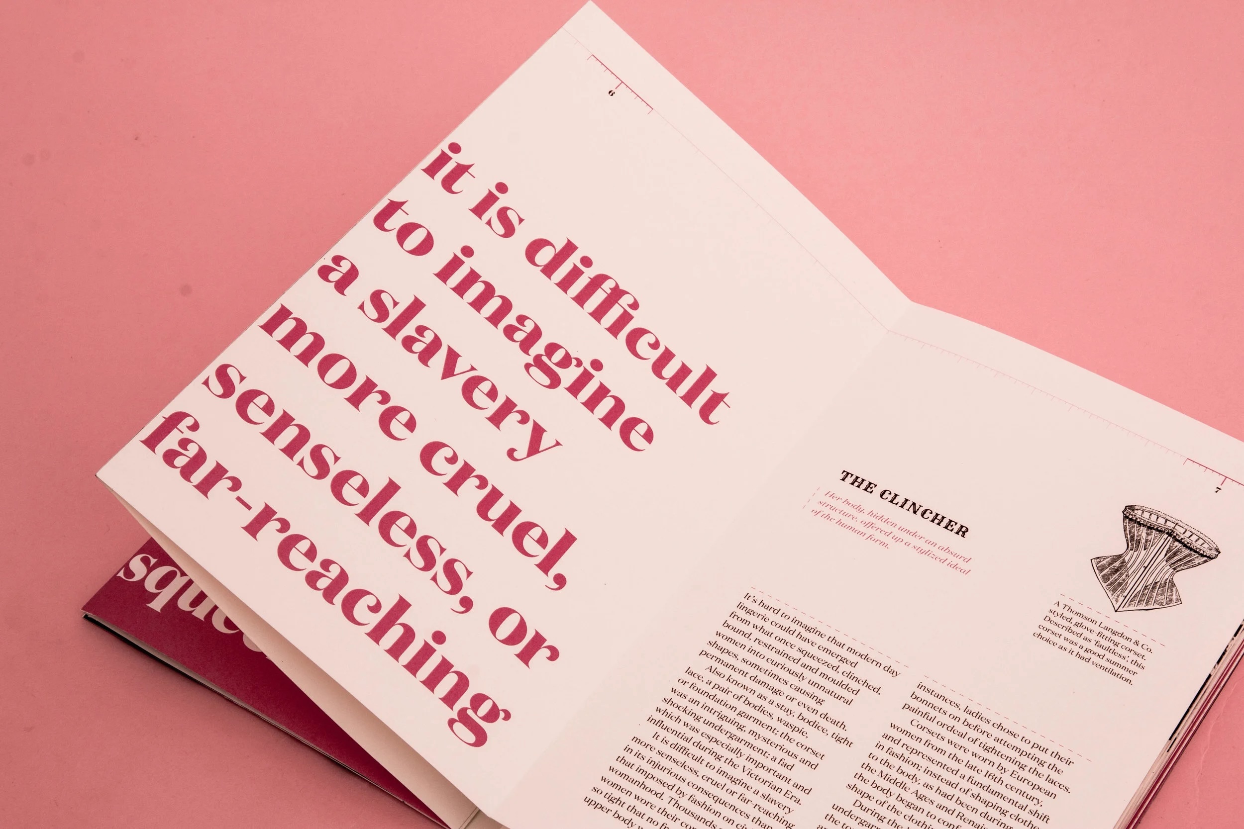
The publication uses typography to explore ideas of compression and control. A key visual system is the relationship between the numbers 8 and 0, where the inner counter of the 8 is interpreted as a squeezed 0—suggesting restriction, distortion, and forced form.
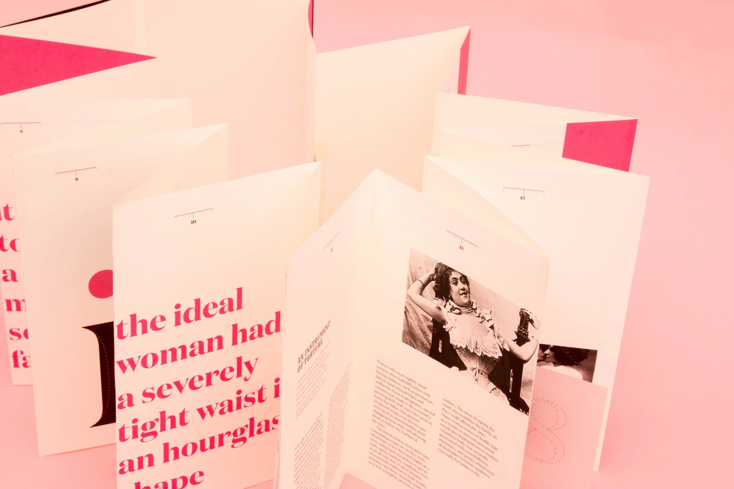
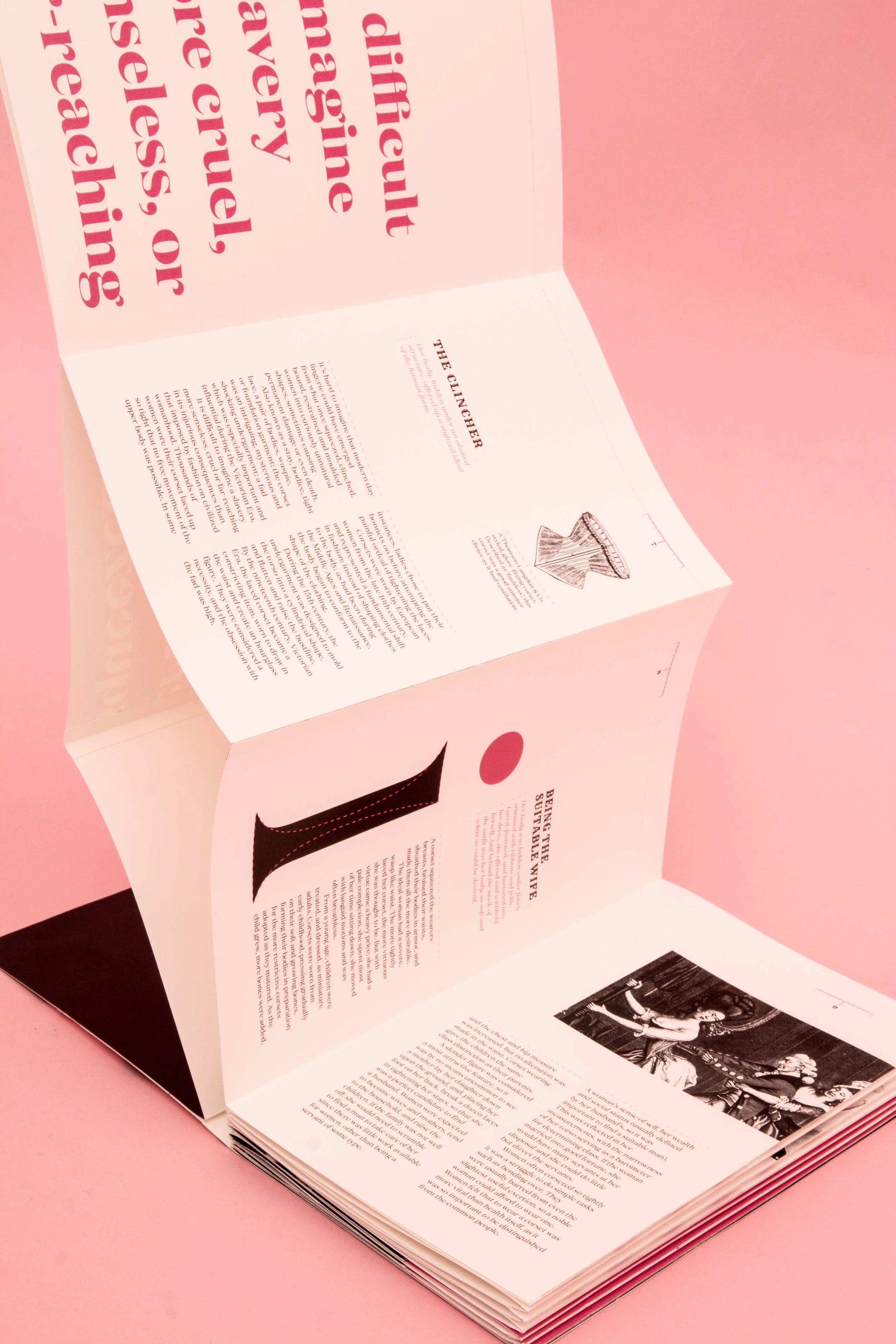
This concept is extended through typographic devices including measuring tapes, ribbons, and brackets, reinforcing a consistent language of constraint throughout the layout.
Page numbers are treated as a shrinking tape measure, gradually reducing in scale across the publication to suggest compression over time.
The “i” character is also used as a figure-like form within the composition, further linking type and the body.
Outcome
The final publication combines historical reference with typographic experimentation to form a system that reflects both the beauty and discomfort of restriction. Through repetition, scale, and compression, it presents fashion as both cultural expression and a mechanism of control.
Interested in working together? Contact me at hello.genevieves.design@gmail.com